Have you ever wondered why there are so many different key performance indicators (KPIs) for trade promotion? The reason is simple. Trade promotion is complicated. All aspects of trade promotion can’t be measured by just one number… or even a few numbers. Much like the instrument panel in an airplane, many different KPIs are needed to get a complete picture of where you’ve been and where you are going.
Of all the TPM KPIs, my personal favorite is the weekly bump chart. In the late 1970’s, I used bump charts in presentations of my trade promotion analysis. There were many late nights creating overhead projector transparencies from computer printouts and using color markers to make the charts come to life. What I learned is that I didn’t really know a brand and its promotions until I looked at the weekly charts. Yes, I had a ton of annual and quarterly summaries with all the KPIs any analyst would request. For me, many of the best analytical insights were hidden in the weekly details.
For example, consider a year-to-date report for a customer and product that shows sales are flat. A quick look a weekly chart could show you any of these underlying situations:
- A dramatic downward trending base sales that’s hidden because an extra deal this year has managed to keep total sales level. Without the second promotion, year-to-date sales would be down dramatically.
- The reverse of the previous point. The brand could have a very strong base that’s growing, but a reduction in deal frequency or a change in promotional tactics results in lost incremental volume, and flat year-to-date sales.
- The weekly charts could show a business highly dependent upon promotional activity because most of the sales are incremental and due to trade promotions. This could be visualized as very few shipments across the year, or a very low base compared to promotional lift during the promotion events.
- We could see a very stable business with shipments almost every week, and not much variation from week to week.
Each of the above situations could have year-to-date sales KPIs in reports that suggest business as usual. However, a quick look at the weekly bump chart would reveal urgent and unique situations, each needing a different trade promotion strategy and tactic.
By the 1980’s, a new version of the bump brought these charts front and center. A new company called Information Resources, Inc. made weekly bump charts of retailer’s scan sales possible. By the 1990’s, weekly bump charts were easy to create and plentiful thanks to a new tool called the PC.
Let’s first describe some bump charts:
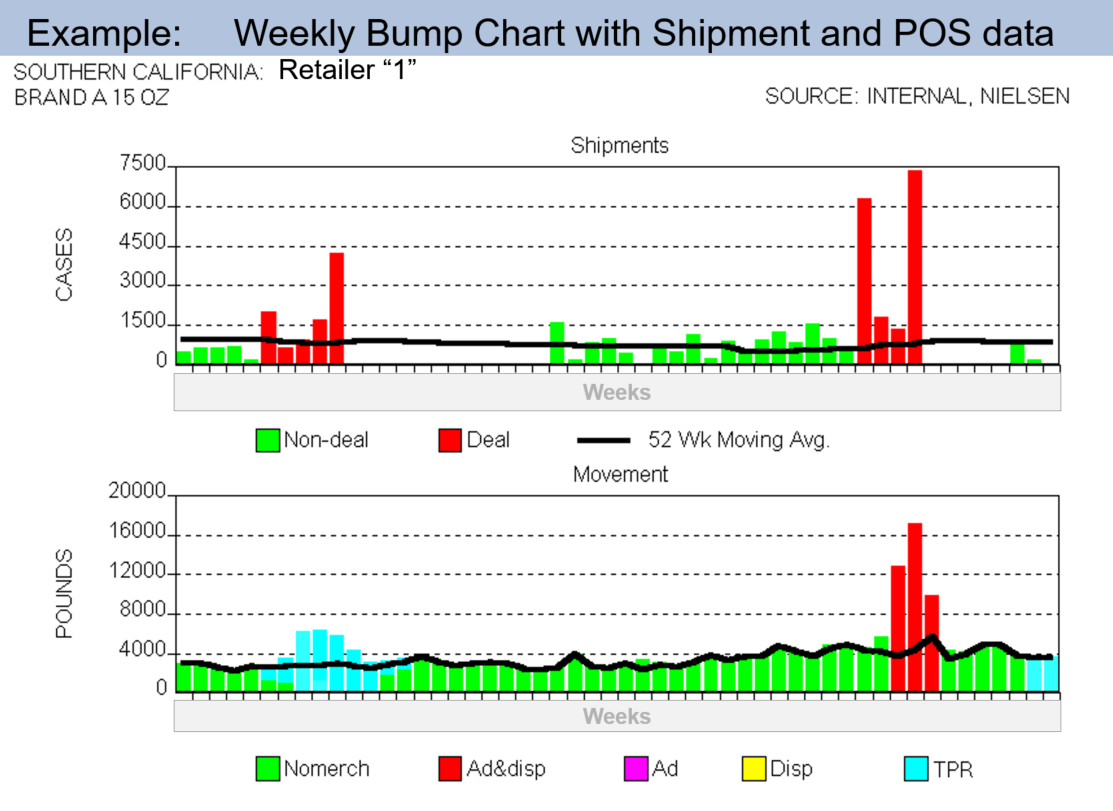
Weekly Sales of shipments: Stack bar chart that shows sales broken out between full-price and promoted. Add a baseline as a line through the bars and mark the official start/end dates for the promotions on the horizontal axis and you have a classic. [See the top graph in the chart above.]
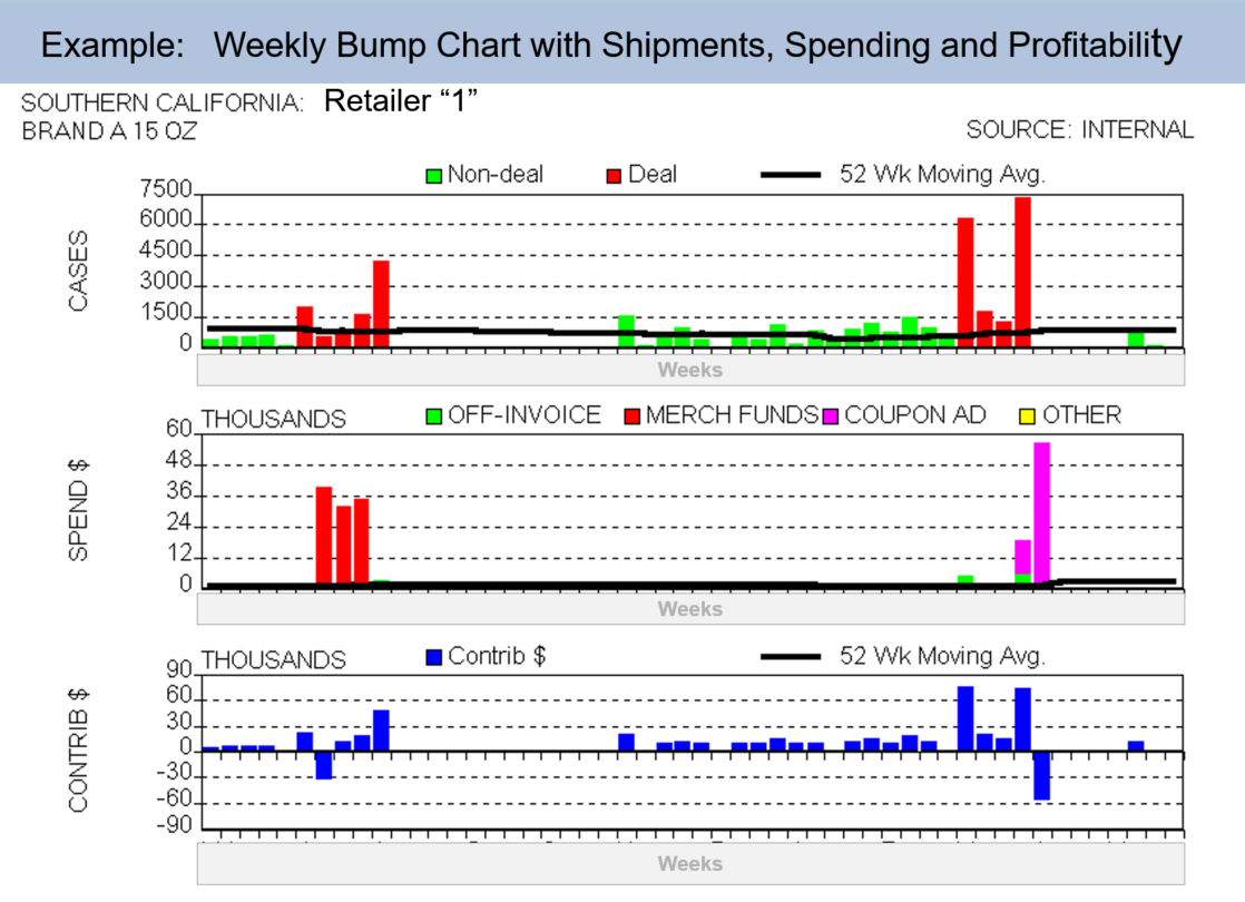
Weekly Spending and profitability: Again a stack bar chart that shows some attribute of your spending and profitability. It could be by trade fund or method-of-payment. You’ll be surprised at how bad data and huge payments jump out of the chart. Add a 52 week trend line across the bar charts and you can see spending trends too. [See the example below this text.]
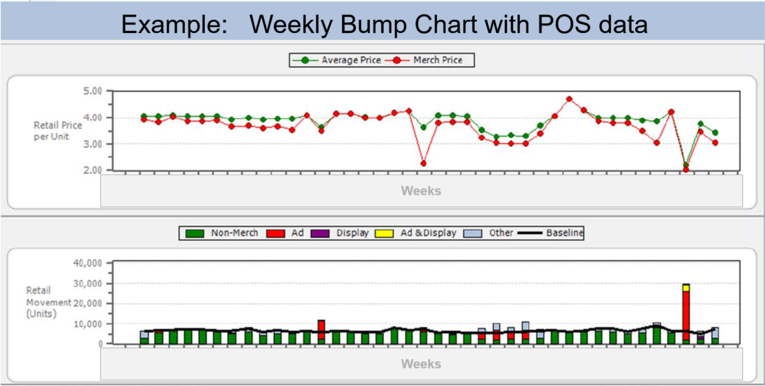
Weekly Syndicated and POS: I’ve seen this bump chart in several variations. I like the format with a compound bar or line chart where each type of merchandizing units are identified with different colors; ad only, display only, ad & display, TPR, all other. [Weekly POS data is the the bottom graph in the example above. Another example with only POS data is the last example below this text.]
Seasonality, base sales, forward buys and consumer pantry loading effects, promotional lift, percent sold on deal, deal vs full-price sales buying patterns, shipment frequency, diverting in, diverting out, early and late ships are a few of the insights that weekly bump charts can provide.
Today, nearly 35 years after my first encounter with bump charts, I still admire the power and simplicity of bump charts. That’s why I consider bump charts the hidden gem of TPM KPIs, and must-have functionality for TPM solutions.
Alex Ring
President
CG Squared, Inc.


